UX Case Study : Improve COMPFEST 13 Recruitment Website
COMPFEST is the largest annual IT event held and organized by students of the Faculty of Computer Science, University of Indonesia.
This case study was created to document the process I did in redesigning a COMPFEST recruitment website.
—
The goal of this case study is to improve the COMPFEST 13 recruitment website to meet user needs.
Impact what I try to give if this design can be implemented is to create a registered website for the COMPFEST 13 committee is easier.
The idea from this case study I got when I registered as the committee for COMPFEST 13.
Problems
When I registered for COMPFEST 13 committee, I feel hard when finding the division I wanted. That because I can’t see the menu division directly. Due to this problem, I assumed the idea to create the website look easier, then I can get immediately the division I find.
Research
The research I do is to know if other people also get the problem. I do interviews with other COMPFEST 13 committee registrants.
I got 4 respondents who were Fasilkom UI students and registering for the COMPFEST 13 committee. The results of the interviews were as follows:
“gw pas lanjut, milih lanjut gasengaja, jadi langsung gabisa diubah lagi” — BG
“scroll yang bagian kiri detailnya kurang pas, dia jadi agak kebawah gitu, kayak ngira lu scroll udah mentok bawahnya, tapi ternyata masih ada.” — VS
“Salut sama webnya, Website nya udah user friendly, ga ada ngerasa kesulitan pas ngegunain websitenya” — JA
“Waktu daftar sering kepencet gitu, gabisa dibatalin, ga ada konfirmasinya” — KR
User Need
From the problem that I got from an interview, I list down the things that user needs, those are:
- Create a confirmation for the user that the selection division is correct and can’t be changed,
- Placing the division card on the more looked place.
User Flow
User flow below is COMPFEST 13 registration processes from the landing COMPFEST recruitment website to the assignment submission page.
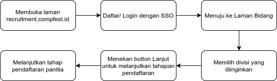
COMPFEST 13 Registration Processes Flow
Wireframe
For the Lo-Fi wireframe, I made it by handwriting. The wireframe is made to provide an overview when making a prototype.
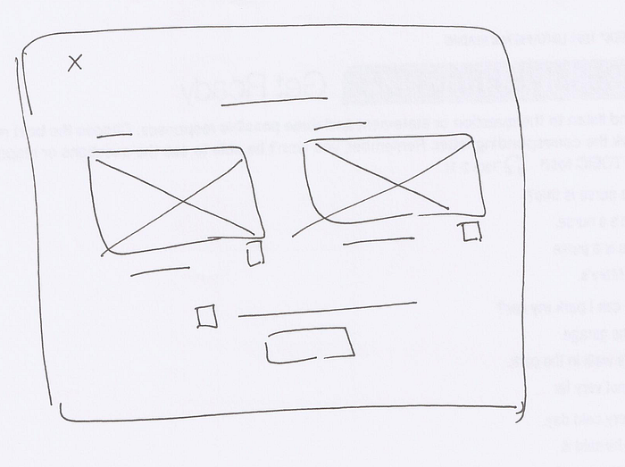
Confirmation Modal
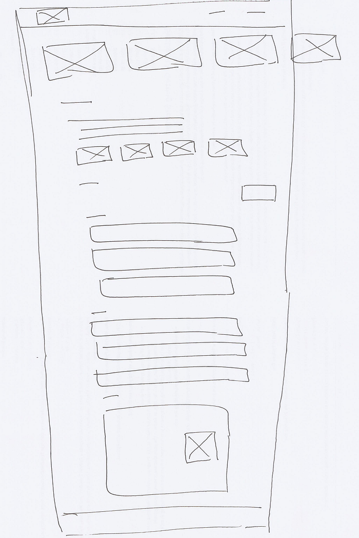
New Page Style
Prototyping
Prototyping is the wireframing process to make the result of the research more realistic and easy to understand.
- Verification feature when submitting selections
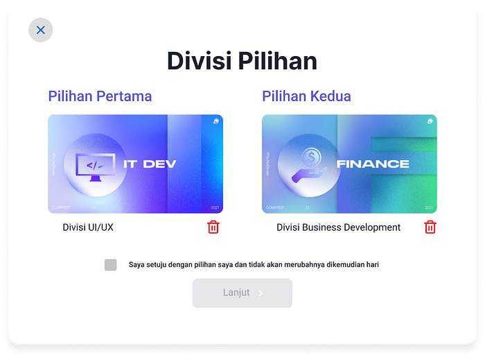
Modal Prototype
In this modal, the user will be asked for an agreement by a checkbox to continue to the next step to ensure that the user’s choice is correct.
- Field Pages
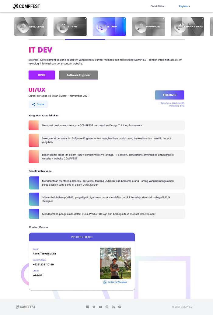
Page Prototype
On this page, the division card is moved to the top of the page. Then the user will more clearly when looking out the division what they find.
End of Case Study
This design is made based on interviews with several users. I hope that these case studies can meet the needs of users.
So these case studies about COMPFEST 13 recruitment website, I hope this case study can be a lesson and inspiration for many people in the future.
© Reyhan Ariq Syahalam.Github